
Tokens,color, type, spacing, motion
The raw values everything else is built from. Change a foundation token and the change propagates everywhere automatically.
Four teams building four different parts of the product, each making visual decisions independently. The result wasn't catastrophic,but it was clearly unsustainable.
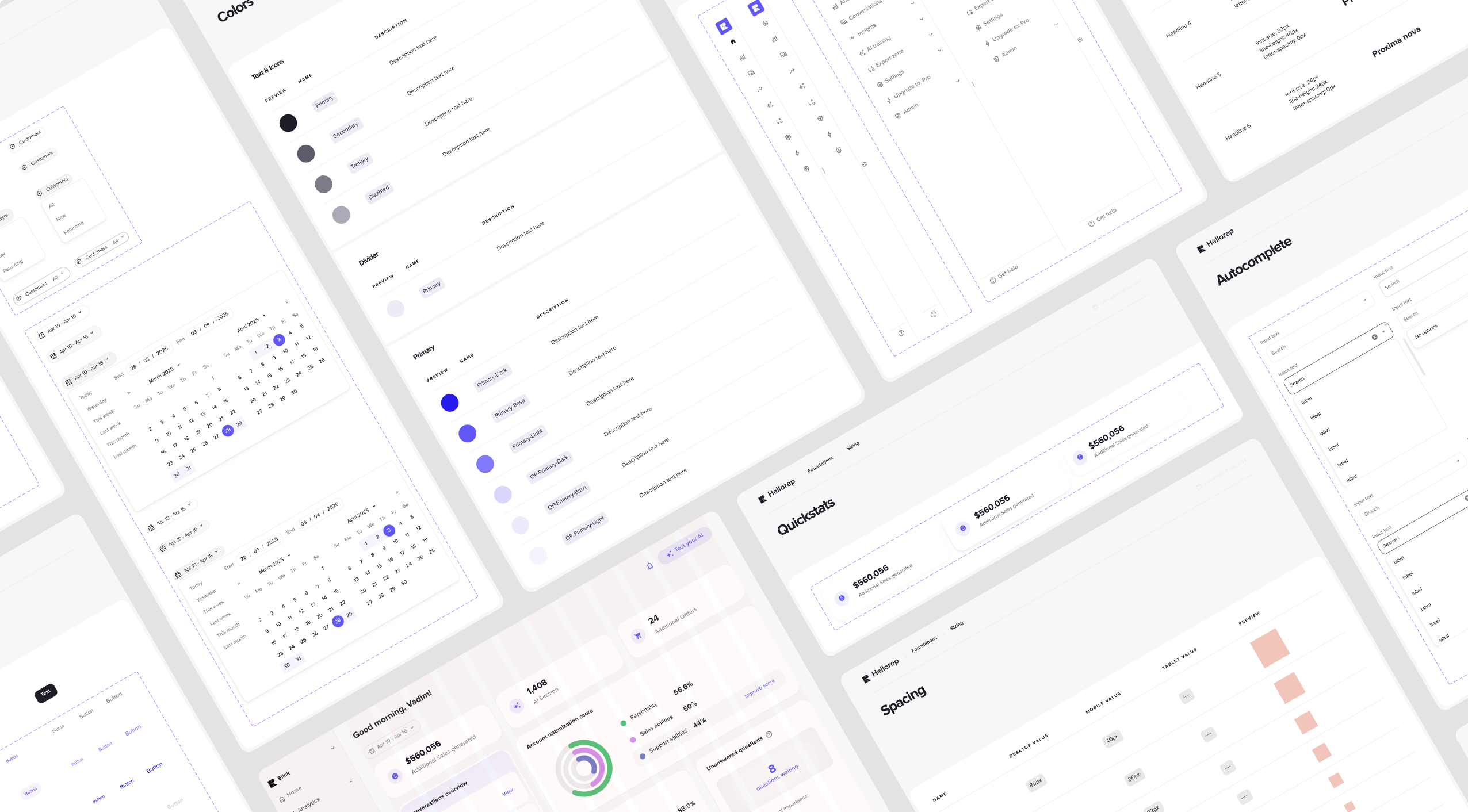
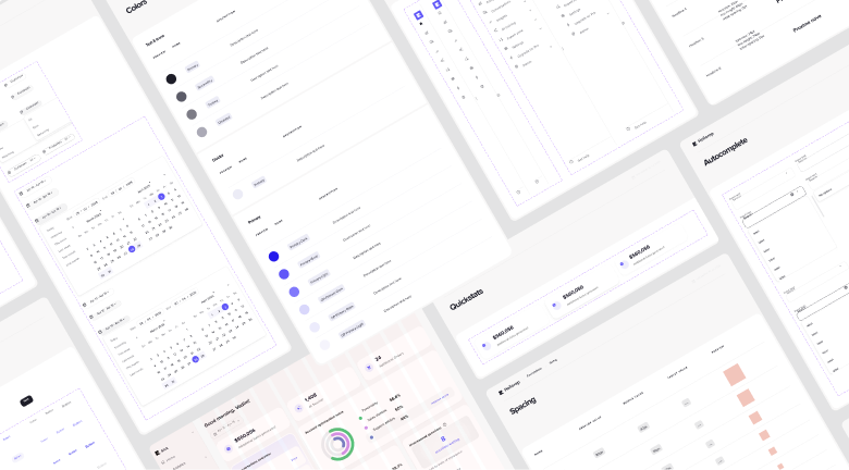
In practice at HelloRep, the inconsistency showed up in specific places. A primary button in the Flow Builder was a slightly different shade of purple than the same button in Analytics. Form inputs in onboarding had different padding to form inputs in Settings. The chat widget used one icon set; the dashboard used another. None of these were intentional. They were the accumulated side-effect of four teams making reasonable-seeming local decisions without a shared reference.
The problem wasn't primarily aesthetic,it was cognitive. Every inconsistency is something a user has to process and dismiss. Enough of them and the product feels assembled, not designed.
Growth without design adhesion,not sustainable from here.
Growth without design adhesion,not sustainable from here.
The system is built in four layers, each narrower and more specific than the one below it. Any layer can extend the one beneath,but can't contradict it. That's what gives the system authority without making it rigid.
The raw values everything else is built from. Change a foundation token and the change propagates everywhere automatically.
Reusable building blocks with documented states, variants, and accessibility. No team builds their own version.
Assembled from components,empty states, filter bars, confirmation dialogs, data tables. Things that appear in multiple domains in the same form.
Page-level scaffolding specific to each domain. Different between Flow Builder and Analytics,but both inherit from the layers below.

Not everything can or should be shared. The chat widget has patterns that don't exist anywhere else,typing indicators, AI state signals, product cards inside a conversation thread, confidence level displays. The Flow Builder has its own canvas controls and node anatomy. These are domain-specific patterns that belong to the system but live in a dedicated layer above the shared components.
This distinction,shared foundation, domain-specific layer above it,is what makes the system practical. Teams have a defined space for their specific needs, with a clear line below which they don't change things without review.
A design system without ownership is just a suggestion. The governance model defines who owns each layer, who can extend it, and who needs to go through review. Foundation tokens are owned centrally,the impact is platform-wide. Shared components are owned by the design system. Domain patterns are owned by domain teams, who can add freely but can't override what's below. This keeps the system authoritative without creating friction for the teams building features.
Fewer visual decisions to make. Token names are semantic. The system answers "what colour should this be" before it's asked.
Fewer inconsistency reviews. New work starts from existing patterns. Edge cases have a place to go.
New features slot into an existing visual language. The product doesn't look different after every sprint.
A product that feels considered,same spacing, same interactions, same feedback patterns wherever they go.
The HelloRep design system resolved the consistency problems and created the conditions for the platform to keep growing without fragmenting. Engineers spend less time on visual decisions. Designers spend less time catching inconsistencies. Merchants get a product that feels considered,even as the team behind it continues to move fast.