
Typography, Spacing, Color tags, Link
The atomic design tokens,the values and decisions that flow through every layer above them.
Three teams, four codebases, no shared components. Here's what was built to prevent that from happening again.
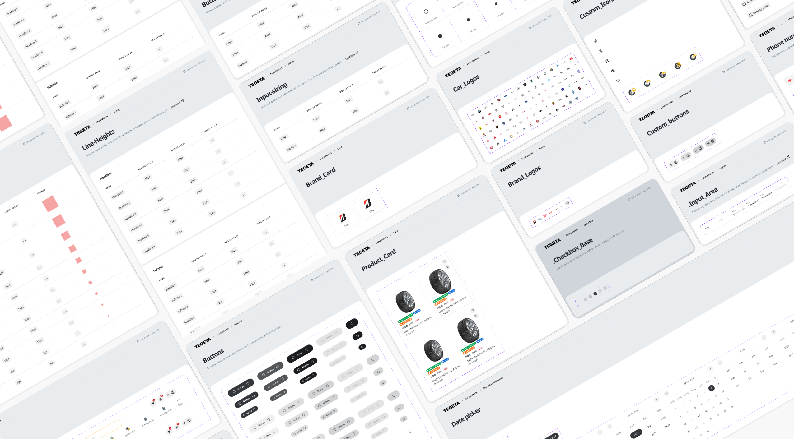
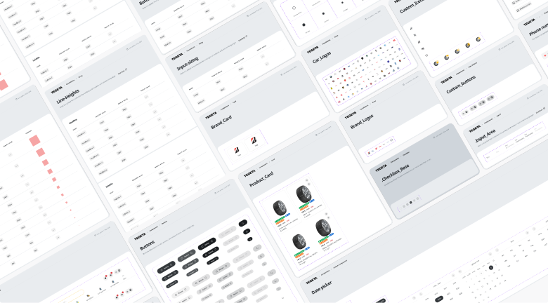
An audit of the ecosystem found 2 different button styles, 14 pattern variations, and 56 components,with no shared tokens between any of them. Every platform had developed its own interpretation of what a button, a navigation element, or a form field should look like and do. Teams re-solved the same problems independently. Component structures couldn't be reused. Terminology wasn't shared,which meant engineers and designers were building from different assumptions about the same component.
The ecosystem didn't just need a component library. It needed a formal mechanism for maintaining structure,not just creating it.
Components shared names between platforms but not specifications. A "button" in one codebase was a different thing from a "button" in another. Navigation patterns were implemented differently by each team, producing inconsistencies users felt but couldn't name. Terminology mismatches meant a "card" in one team's language was structurally different from a "card" in another's. Without a shared foundation, consistency couldn't be enforced,which meant it couldn't scale.
The system was organized into four layers, each with a distinct responsibility. Together they created conditions for consistent decisions at scale,not just consistent aesthetics.
The atomic design tokens,the values and decisions that flow through every layer above them.
Shared primitives built once and consumed across all platforms.
The systemic design tokens,the rules for how components combine and behave together.
The framework governing how all layers connect and evolve over time.
The structural framework was built to prevent fragmentation rather than introduce it. Clear ownership meant each component had a designated team responsible for it,preventing the ambiguity that caused design decisions to drift. Documentation standards were versioned alongside components so changes carried recorded rationale. And the governance model was designed to allow controlled evolution,firm about foundations, flexible about expression.
A design system that prevents all iteration is just as broken as one that allows none at all.
The component hierarchy provided the structural model around which to use the same taxonomy. Aligning Product, Engineering, Design, and Operations around the same components meant structural decisions became transparent and repeatable. Design stopped being duplicated across teams. Structure became sustainable in a way it hadn't been before.
Feature-level components aligned to interaction patterns
Implementation-ready specs with clear token references
Figma libraries synced with the structural layer
Operational components tailored to internal tools

The design system introduced domain-level structure into coordinated design execution. Design effort stopped being duplicated across teams. The ecosystem shifted from each team making its own decisions about what a navigation element should be, to the system making that decision once and propagating it consistently. Structure became something the organization could maintain,not just something one designer had created.